Every year companies spend millions of dollars buying online banners. However, very few people click them. In this post I’ll tell you why and how to fix this problem. Few simple changes will make a world of difference.
Banner blindness
Today banners are a main part of home- and “landing pages”. However, most banners are completely ignored by the customers due to some very good reasons. Today our brains are so exposed to vast amounts of advertisement, that our subconsciousness automatically helps us weed out unnecessary information. If a banner looks to too much like an advertisement, there is a strong likelihood that the brain completely avoids looking at it – consciously or unconsciously. This is called “banner blindness”.
If you carry out an eyetracking usability test, the output of the test is called a “heat map”. This heat map tells you, where the customer looks the most (the red hot spots), where the customer looks the least (the green, colder spots) and where the customer doesn’t look at all (the black areas).
Here is a good example of “banner blindness” from an eye-tracking test of the Virgin Megastore website:
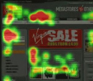
When this eye-tracking test was carried out, Virgin ran a large scale sales campaign, however, none of the website’s visitors looked at it. This is due to the fact, that the red “Virgin Sale” banner looks too much like a banner / advertisement, which makes the customers’ subconscious mind rule it out as irrelevant content. This is a well kept secret for many people, and designers thus often don’t know of this problem. “Banner blindness” therefore is a massive problem at almost all e-commerce websites. They are stuffed with banners that convert badly, because few customers are looking at them.
How do I make people look at my banners?
To avoid banner blindness at your website, you should try not to make your banners look like, well banners. Below is a banner from Tesco that most likely will be ignored by the customers:
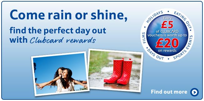
Why might customers ignore this banner? The main reason is that the banner has a background color which is a classic banner design flaw. The background color “tells” the customer’s subconscious mind that the banner most likely is not relevant and then the mind immediately ignores it. Furthermore the text is blue on a blue background which makes the text blend into the visual impression of the banner – it should have had a contrast color to make it stand out. Finally the “Find out more” link is a way too subtle “call-to-action” link.
Stop designing “banners”
To avoid these problems at your website, you should stop designing banners that look too much like classic banners or 3rd party banners. Apple are masters at this. Their “banners” work, essentially because they do not look like banners – they are instead designed to look like relevant content:
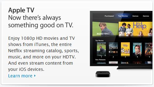
These Apple banners have no or just a very light grey background color, which make them look as though they are an essential part of the website, which is the main reason why they actually work. They furthermore have a clear header and an equally clear “Learn more” link (Apple knows, that good old blue links still are the best way to catch the customers’ attention).
Follow these simple steps
Make your “banners” convert much better at your website by:
- Not making the banners look like, well banners or third party banners / advertisements / content
- Using no (or a very, very subtle background) color
- Having clear headers that are easy to read
- Making call-to-action buttons or links very obvious
I hope this post has inspired you to improve your online “banners”? Please do feel free to comment!
Hey Benjamin,
Do you know of any Danish companies that master the “banner art”?
/Mikael
Hi Mikael – not really, I’m sorry. But please send the link to whomever is designing your banners! 🙂
I don’t ever see myself using banners. So many better options available 🙂
Great post.
@Mikael & Benjamin: Some months ago I had a talk with Jens Jakob from Runforest.dk about banners – the talk led to the banner they have on the frontpage of http://runforest.dk now – i recon it’s an example of a banner that meets your requirements – and it’s Danish 🙂
Lasse Kjær
Thank you + they certainly do. Excellent to experience people doing things the right way 🙂
Thank you Lasse. Great example.
Great post – And I thought that there was no way around banner blindness, but your example with apple banners describe very well, that it could work.
Thank you very much, Per.
At http://www.marketingcamp.dk I went to see @tsonderstrup talk about banner usage at Canal Digital, and he has written about the concept ‘Path to conversion’ here (in Danish): http://tsonderstrup.tumblr.com/post/12002887037/path-to-conversion-kig-klik-k-b.
It was extremely interesting to hear how they can track the impact of banners. They might not convert directly from click to a sale, but using banners the right way still has a huge impact for them.
Thank you for the link to the Canal Digital study. No matter this “Pat to conversion” discussion, simple banner design changes would improve the initial click rate no.matter.what.
Hi Benjamin – excellent post.
Do you have any examples of banners performing substantially better by using these guidelines. Eg.: numbers showing increased CTR or similar increased conversion in other marketing channels?
Thank you very much Rasmus 🙂
Unfortunately most websites do not follow the guidelines, however, I could fine some but it would take some investigation / time – which channels do you have in mind?
Benjamin – Any channel would be fine 🙂
Or maybe @Lasse kan share som insights on runforest?
Ah, quite a scope there = any channel 😉
Here are some websites that might inspire you: http://www.apple.com, http://www.barnesandnoble.com and Dell (not all banners are good at Dell, though!).
Very good post – But I’d also like to know the case wherein I am not designing the banners. Instead I am just using banners provided by advertisers. For e.g. Adsense. I do not have any control over what color banner I want to display on the site. At max. I can restrict particular ad from being displayed. Any pointers in this case? How to improve?
Thanks,
Ameya
Hi Ameya. I’m very glad you like the post.
Adwords comply very well with my guidelines, as they are (mostly) text based. However, I believe all companies should consider if it makes sense to insert “real” (designed) 3rd party affiliate banners at ones website, as they often ruin the main purpose of selling products, etc.
I suggest that you define some banner standards which your 3rd party advertisers must comply with.
Best, Benjamin
thank you